THE SPEED FACTORY
In Alzano Lombardo the word factory arouses neither doubts nor disappointments. The Polini Motori building, designed by Joseph Di Pasquale, is a fabbrica in its full etymological sense: what the company makes inspires what the architect makes and the architectural forms document the manufacturing activities. The Val Seriana is dominated by the Italcementi complex, its monumental character providing continuing evidence of its economic and social importance to the territory, even though it is now no longer working. Built in 1883, it was the immensity of the cement factory that had the task of asserting the modernity of its installations and their considerable production capacity. The elegance of the architectural solutions for its structure was also a celebration of the human ability to invent and control machines.
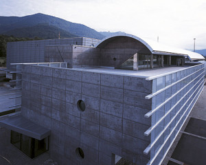
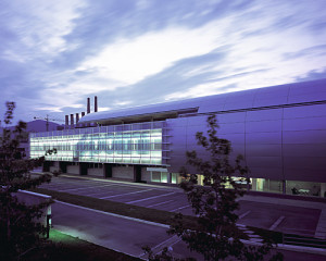
Polini Motori continues along the lines set forth by the old factory and in modern terms speaks the same language of imagination and efficiency. The building occupies a vaguely trapezoidal area, with the oblique side along the junction of the provincial highway, which suggested locating the larger volume further away in the inner, larger part of the lot. This decision determined the principal alignments of the building, which follow the track of the old Val Seriana railway and the layout of Italcementi. The allocation partially below ground level of the cubage intended for manufacturing activities and the volumes of the offices area and racing department, situated so as to be masked from the side facing the road, made it possible for a decidedly large complex (13,800 square metres of utilisation) to be inscribed quite easily within a relatively modest overall area (16,000 square metres).
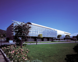
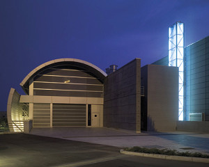
A huge aluminium cylinder serves as the roof for the last floor of the office area and as the frontage of the race department. The differing uses of the building’s constituent parts are indiscernible from the exterior; the perception is of a unifying element that calls to mind the chrome-plated parts of a motorbike. The office façade is spaced away from the building structure and is designed as an extensive screen-printed glass panel that protects the working areas from direct sunlight. This screen is used to exhibit the company logo. The name is presented bearing in mind the support, which is not just a banal architectural copy of headed notepaper or a page of printed advertising. On the wall, the brand logo is able to come to life and reinforce its connection with the product: the imperfectly defined graphic resolution is consistent with the division of the load-bearing structure, which extends only along the horizontal components, while the sheets stop abruptly without a retaining border. The sliding of the façade with respect to the building, of the glass windows with respect to their supporting frame, the aura surrounding the letters of the logo all contribute to the blurred impression of an object that whizzes past our eyes.
In the same way the nature of glass makes its contribution, as though suspended between solid and liquid form, elusive in its transparency, iridescent as it mirrors and reflects. And so also the pale blue of the logo contributes, as it has come to be associated with the “blue” of modern electronics technology that has entered pervasively to transform every form of manufacturing activity. But this is a colour that also brings to mind the blue of water and of air, of elements that ebb and flow. As darkness falls the wall continues to call attention to its communicative function. The building is not illuminated from the outside but, like the vehicles and engines designed and developed in its workshops, switches on its headlights and winds its fluorescent way into the thousands of lights skimming along the asphalt in the dark.
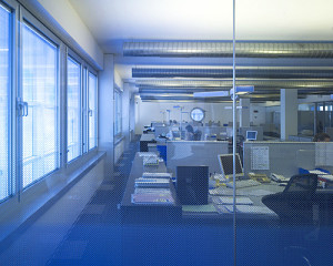
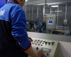
The spaces occupied by the offices and the racing department are separated by a structural gap that serves as an expansion joint and is the site of the entrance. This space, two meters wide and extending along the whole depth of the building, contains the reception, staircases and elevator. The two-floor entrance hall and the many openings onto it convey to the visitor the idea of the complex business organisation and of how the spaces have been distributed for the various departments. From management situated on the second floor to administration and the operative sectors on the first floor. This floor is divided between the jobs of the sales division, research and design carried out in the technical office, processing and tests carried out in the laboratories and testing rooms of the racing department. In designing the divisions within the office area and the idea was to encourage concentration and participation at the same time. The walls dividing the various activities are all glass with graduated screen-printing that starts from opaque at the base to reach total transparency at about one metre sixty from the floor. In the seated position, to carry out work requiring particular concentration, there is the necessary isolation but by standing up it is possible to restore contact with the surrounding environment. The lighting for the work stations directs part of the light onto the desks while the rest is directed upwards to create a soft luminosity in the whole space.
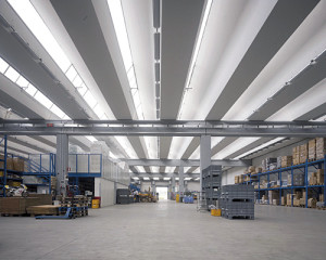
The latest business models are based on teamwork, on decentralisation of initiatives and on greater decision-making autonomy for the workers. Productivity is directly proportional to the capacity for continual information exchange. Therefore the more functional the working are, the more incentive there is for communication and cooperation. A pre-fabricated microshed structure is used for the racing department, the workshop and the testing boxes. On the exterior, thickened panels in dark cement paste, actually obtained using traditional processes, give the volume an especially refined appearance.


